Customize Digital Menu Colors Across All Your Materials
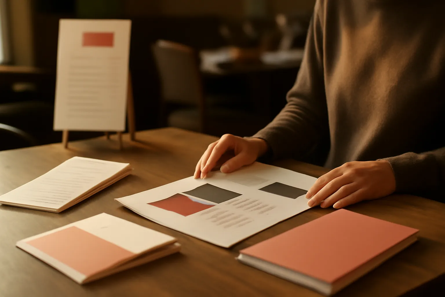
If you have ever tried to customize digital menu colors and ended up tweaking the design in various places, you know how easy it is to waste time and end up with an inconsistent image. One color in the menu, another in the QR code, another in the PDF, and posters that don’t quite look like they belong to the same restaurant. With this new feature, you can now change your style just once and see it applied everywhere.
What changes now in your menu design
From this moment on, the visual customization of your menu works in a unified way. This means that when you choose the color palette and typography for your business, that style is automatically transferred to the main pieces you use every day.
We’re talking about the menu that the customer sees on their mobile, the QR code, the printable posters, and the professional PDF. No more checking each format separately to ensure everything looks the same.
The result is simple: more brand consistency, less repetitive work, and a much more polished presentation for the customer.
The important thing in one sentence
Now you can define your style just once and apply it to the digital menu, the QR code, the posters, and the PDF without having to reconfigure each piece.
Customize digital menu colors without repeating tasks
The great advantage of this improvement is not just aesthetic. It’s operational. Before, when you wanted to update your restaurant's image, a small design decision could turn into several consecutive tasks: adjusting one color here, checking another there, verifying if the PDF matched, and redoing a poster.
Now the process is much more straightforward. You choose the overall style, and the system maintains it across all visual touchpoints of the menu. This helps you work faster and avoids typical mistakes like using different shades, mixed fonts, or materials that look like they belong to different brands.
- Fewer steps: you change once, not multiple times.
- Fewer errors: the risk of visual inconsistencies is reduced.
- More agility: ideal for seasonal changes or campaigns.
- Better image: everything looks aligned with your identity.
If you are working on your venue's image or want your menu to look more professional, this improvement fits especially well with what you can already do in the features of iaMenu.
How it works in the daily life of the restaurant
Let’s think about a real situation. The summer season begins, and you decide to give your menu a fresher look. Instead of changing several designs separately, you adjust your style just once, and the new look appears where it matters.
That change reaches the QR menu that your customers consult, the material you print for tables or windows, and the PDF you share with groups, hotels, or events. Everything maintains the same visual line without you having to chase each detail manually.
It’s also useful if you manage multiple needs at the same time: dining room, terrace, delivery, events, or special menus. The more material you use, the more valuable it is to control the image from a single point.
Before: you changed a brand color and then had to review the mobile menu, QR, posters, and PDF one by one.
Now: you define the style once and maintain a consistent appearance across all main supports.
What your restaurant gains with a coherent image
When everything visually fits together, the customer notices it even if they don’t say it. A well-presented menu, a QR that follows the same line, and a PDF with a professional look convey more trust. And in the restaurant business, trust also influences how your proposal is perceived.
Here are some concrete advantages:
- More recognizable brand: your colors and style are consistently repeated.
- Better perception of the venue: it conveys order and attention to detail.
- Faster to launch changes: promotions, holidays, or special campaigns.
- Less dependence on redoing materials: one update affects everything.
Additionally, this visual coherence complements other key areas of the menu very well, such as clear allergen information in allergen management or connections with other business channels from the integrations.
A concrete example: seasonal change in one action
Imagine a restaurant that uses more subdued tones in winter and wants a brighter, fresher image in summer. Previously, that change could involve a chain of revisions. Now, it’s enough to update the main visual line for the new style to be reflected in all materials associated with the menu.
This is especially useful for businesses that run temporary campaigns, event menus, gastronomic days, or collaborations with hotels. If every change forces you to redo several pieces, you end up postponing it. If the adjustment propagates automatically, it’s much easier to keep your image up to date.
And if you manage different menu formats or need a more polished presentation for groups, the professional PDF gains significant value when it maintains exactly the same visual style that the customer sees on screen.
Ideal for quick campaigns
Christmas, summer, Valentine's Day, gastronomic days, or a private event: with a single visual adjustment, you can adapt the entire menu presentation without starting from scratch.
Frequently Asked Questions
Here are quick answers to the most common questions about this centralized design improvement and how it can help you in your daily operations.
What does centralized design mean in my digital menu?
It means that you choose the colors and typography of your brand just once, and that style is automatically applied to the digital menu, the QR code, the printable posters, and the PDF.
Can I change the colors of my QR menu without editing each format separately?
Yes. You can now update the colors from a single place, and the change reflects in all visual pieces related to your menu.
Does the menu PDF also update with the same brand image?
Yes. The professional PDF adopts the same palette and typography so you maintain a consistent image both online and printed.
Does this help my restaurant look more professional?
Yes. Having the same style in the menu, QR, posters, and PDF conveys order, care, and a stronger brand in front of the customer.
Is it useful if I make seasonal changes or special campaigns?
Very much. You can adapt colors and style for summer, Christmas, events, or promotions and see the change applied everywhere without repeating tasks.
If you want your menu, your QR, and your printed materials to breathe the same visual identity without complicating things, you can see more details in all the functionalities and discover how to apply it to your restaurant.